When you build a WhatsApp template, you’re really stacking a few standard parts on top of each other: variables, components (header, body, footer) and buttons. Learn the parts once and every template makes sense.
Variables
Variables are the blanks in your template — placeholders that get filled with real data when the message goes out. There are two ways to write them.
Positional variables
The classic style. You write {{1}}, {{2}}, {{3}} in your text, and supply matching example values in order. Any template that uses variables must include sample data, or Meta won’t approve it.
"example": {
    "body_text": [
        "Emilia",
        "360dialog"
    ]
}
Here {{1}} would show “Emilia” and {{2}} would show “360dialog” in the preview.
Named variables
Instead of numbers, you can name each blank — easier to read in longer templates. The example uses the _named_params suffix and an object instead of a list:
"example": {
    "body_text_named_params": {
        "greetings_message": "Emilia",
        "company_name": "360dialog"
    }
}
Pick one style per template; don’t mix positional and named in the same one.
Components
A template is built from three components — a header, a body and a footer. Only the body is required.
Headers
The header sits at the very top. You choose one type:
- Text header — a short title line. It supports one variable and is capped at 60 characters.
- Media header — an image, video or document. When you create it you provide an example URL so Meta can preview the media.
- Location header — a map pin. Location headers are only allowed in Utility or Marketing templates, and their properties can’t be customised.
Example: a restaurant uses a menu PDF as a document header; a salon uses its address as a location header.
Body
The body is the only component you must include. It holds your main message text, supports multiple variables, and is capped at 1024 characters. Remember the filled-in variable text counts toward that limit.
Footer
The footer is optional, text-only (no variables), and capped at 60 characters. People use it for lines like “Reply STOP to opt out” or the business name.
Buttons
Buttons are the tappable actions at the bottom of a template. A template can have up to 10 button components in total, but each type has its own rules.
If a template has more than three buttons, the delivered message shows two of them and folds the rest behind a See all options button.
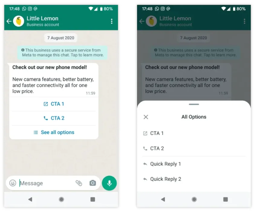
Here are the button types you can use:
- Phone number button — dials a number. Maximum one per template.
- URL button — opens a link. Up to two per template. (Note: the API won’t accept Cyrillic characters in button URLs.)
- SPM button — a “View” button that opens a single product from your catalog.
- Quick reply button — sends a short canned answer back to you, like “Yes” or “No”. Up to 10.
- Copy code button — copies a coupon or discount code to the customer’s clipboard.
- OTP button — used in authentication templates to autofill a one-time code.
- Flows button — opens a WhatsApp Flow (a guided multi-step form).
How buttons can be grouped
Meta is strict about button order. Buttons of the same type must sit together — you can’t interleave them.
- Valid: Quick Reply + Quick Reply + URL + Phone (same types grouped)
- Invalid: Quick Reply + URL + Quick Reply (types interleaved)
Character limits at a glance
| Element | Limit |
|---|---|
| Text header | 60 characters, 1 variable |
| Body | 1024 characters, multiple variables |
| Footer | 60 characters, no variables |
| Buttons | 10 total (1 phone, 2 URL, 10 quick reply) |
Stay inside these and your template will fit cleanly on any phone — and clear Meta’s review with fewer questions.